KeyPress in ON so you can try with left and right arrows.
<div class="slider-container" id="noWrapper2">
<ul >
<li>
<div class="slide-content">
<h2>Learn how to surf!</h2>
<p>It can be really easy for you!</p>
<a class="btn btn-warning">Learn Now</a>
</div>
<img src="img/beach-full.jpg" class="img-background" />
</li>
<li>
<img src="img/birds-full.jpg" class="img-background"/>
</li>
<li>
<img src="img/eagle-full.jpg" class="img-background"/>
<div class="slide-content">
<h2>Look for the Eagle EYE!</h2>
<p>It can be really easy for you!</p>
<p>Just look into the EYE! :D</p>
</div>
</li>
<li>
<img src="img/lighthouse-full.jpg" class="img-background"/>
</li>
<li>
<img src="img/palms-full.jpg" class="img-background"/>
</li>
<li>
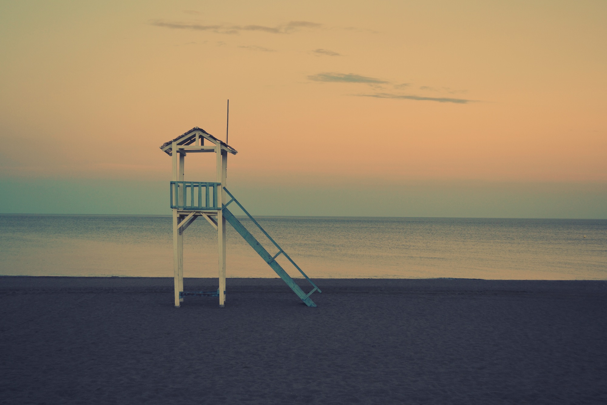
<img src="img/tower-full.jpg" class="img-background"/>
</li>
</ul>
<a class="goLeft slider-control" >
<span class="glyphicon glyphicon-chevron-left" aria-hidden="true"></span>
<span class="sr-only">Previous</span>
</a>
<a class="goRight slider-control" >
<span class="glyphicon glyphicon-chevron-right" aria-hidden="true"></span>
<span class="sr-only">Next</span>
</a>
</div>
  #noWrapper2  {position:relative;}
#noWrapper2 .slider-control {
    position: absolute;
    top:35%;
    display:block;
    width:48px;
    height:48px;
    cursor:pointer;
    transition:all 1s ease;
    z-index:3;
  }
  #noWrapper2 .slider-control span {
    position: absolute;
    display:block;
    padding-top:1em;
    text-align: center;

    width:48px;
    height:48px;
    border-radius:100%;
    background-color:#fff;


  }

  #noWrapper2 .slider-control.goLeft {
    left:-1em;
  }
   #noWrapper2 .slider-control.goLeft:hover {
    left:0em;
   }
  #noWrapper2 .slider-control.goRight {
    right:-1em;
  }
  #noWrapper2 .slider-control.goRight:hover {
    right:0em;
  }
  #noWrapper2 li {
    position: relative;
    display:block;
    width:100%;
    height:160px;
    overflow: hidden;
      }
 #noWrapper2 li > img {
    width:100%;
    max-width: 100%;
    height:auto;
    display:block;
 }
#noWrapper2 li .img-background {
    position: absolute;
    z-index:1;
    width:100%;
    height:auto;
    left:0;
    top:0;
  }
  #noWrapper2 li .slide-content {
    position: relative;
    z-index: 3;
    font-size: 1em;
    font-weight: bold;
    background-color:rgba(0,0,0,0.2);
    color:white;
    padding:1em;
    width:50%;
    margin: 15% auto;
  }
 /*Setting new definitions for slides for widths above 480px*/
  @media screen and (min-width:481px){
    #noWrapper2 li {

    min-height:320px ;

    }

 }

 /*Setting new definitions for slides for widths above 480px*/
  @media screen and (max-width:768px){
    #noWrapper2 li .slide-content {
    margin:0 auto ;
    font-size:1em;
    width:80%;

    }
    #noWrapper2 li .slide-content h2{
      font-size:1em;
    }
    #noWrapper2 li .slide-content p{
      font-size:.75em;
    }
 }
 /*Setting new definitions for slides for widths above 768px*/
     @media screen and (min-width:768px){
    #noWrapper2 li {

    min-height:500px;

    }

#noWrapper2 .slider-control{
   width:120px;
    height:120px;
}

  #noWrapper2 .slider-control span {

    padding-top:.75em;

    font-size:3em;
    width:120px;
    height:120px;

  }

  }


   @media screen and (min-width:1200px){
    #noWrapper2 li {

    min-height:768px;

    }

  }
$(document).ready(function(){
      $("#noWrapper2").Listy({
        handleLeft: "#noWrapper2 .goLeft",
        handleRight: "#noWrapper2 .goRight",
        fullWidth:true});
  });
This documentation is used to learn how to use the Listy Slider and also see other examples on how it can be used