Book List
Book List should have small sized images and represent their eBook size ratio if wanted
In this example we pretend that every slide is a Book Cover.

Birds Flying
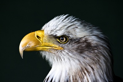
Eagle Eye
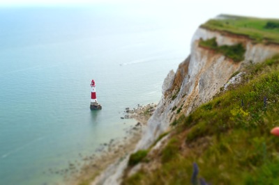
The Lighthouse

Palms
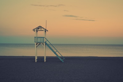
Baywatch
-
Birds Flying
-
Eagle Eye
-
The Lighthouse
-
Palms
-
Baywatch
<div class="slider-container" id="noWrapper">

  <ul >

    <li>
      <img src="img/birds.jpg"  class="img-background"/>
      <h2>Birds Flying</h2>
    </li>
    <li>
      <img src="img/eagle.jpg"  class="img-background"/>
      <h2>Eagle Eye</h2>
    </li>
    <li>
      <img src="img/lighthouse.jpg"  class="img-background"/>
      <h2>The Lighthouse</h2>
    </li>
    <li>
      <img src="img/palms.jpg"  class="img-background"/>
      <h2>Palms</h2>
    </li>
    <li>
      <img src="img/tower.jpg"  class="img-background"/>
      <h2>Baywatch</h2>
    </li>
     <li>
      <img src="img/birds.jpg"  class="img-background"/>
      <h2>Birds Flying</h2>
    </li>
    <li>
      <img src="img/eagle.jpg"  class="img-background"/>
      <h2>Eagle Eye</h2>
    </li>
    <li>
      <img src="img/lighthouse.jpg"  class="img-background"/>
      <h2>The Lighthouse</h2>
    </li>
    <li>
      <img src="img/palms.jpg"  class="img-background"/>
      <h2>Palms</h2>
    </li>
    <li>
      <img src="img/tower.jpg"  class="img-background"/>
      <h2>Baywatch</h2>
    </li>
  </ul>

  <a class="goLeft  slider-control" >
    <span class="glyphicon glyphicon-chevron-left" aria-hidden="true"></span>
    <span class="sr-only">Previous</span>
  </a>
  <a class="goRight   slider-control" >
    <span class="glyphicon glyphicon-chevron-right" aria-hidden="true"></span>
    <span class="sr-only">Next</span>
  </a>
</div>
    #noWrapper  {position:relative;}
  #noWrapper .slider-control {
    position: absolute;
    top:35%;
    display:block;
    width:48px;
    height:48px;
    cursor:pointer;
    transition:all 1s ease;
    z-index:2;
  }
  #noWrapper .slider-control span {
    position: absolute;
    display:block;
    padding-top:1em;
    text-align: center;

    width:48px;
    height:48px;
    border-radius:100%;
    background-color:#fff;


  }

  #noWrapper .slider-control.goLeft {
    left:-1em;
  }
   #noWrapper .slider-control.goLeft:hover {
    left:0em;
   }
  #noWrapper .slider-control.goRight {
    right:-1em;
  }
  #noWrapper .slider-control.goRight:hover {
    right:0em;
  }
  #noWrapper li {
    position: relative;
    display:block;
    width:220px;
    height:320px;
    border:10px solid white;
    background-color:#2c3e50;
    overflow: hidden;
      }
 #noWrapper li > img {
    width:100%;
    max-width: 100%;
    height:auto;
    display:block;
 }

  #noWrapper li .img-background {
    position: absolute;
    z-index:1;
    width:100%;
    height:auto;
    left:0;
    top:0;
  }
  #noWrapper li h2 {
    position: relative;
    z-index: 3;
    font-size: 1em;
    margin-top:10em;
    font-weight: bold;
    background-color:rgba(0,0,0,0.2);
    color:white;
    padding:0.5em;
  }
$(document).ready(function(){
      $("#noWrapper .slider-container").Listy({
          configDefault: {items:5, sliding:2},
          config: {
            "480": {
              items: 1,
              sliding: 1
            },
            "768": {
              items:2,
              sliding:1
            },
            "991":{
              items:3,
              sliding:2
            },
            "1200":{
              items:4,
              sliding:3
            }
          },
          animationEffect: "ease-in-out",
          animationDuration: 1000
      });
  });